
Android中shape的使用
Android中常常使用shape来定义控件的一些显示属性,今天看了一些shape的使用,对shape有了大体的了解,稍作总结:
-
一、在res/drawable文件夹下创建一个名为gradient_box的xml文件:
<?xml version="1.0" encoding="utf-8"?>
<!--
shape drawable xml文件中定义的一个几何图形,定义在res/drawable/目录下,文件名filename称为访问的资源ID
在代码中通过R.drawable.filename进行访问,在xml文件中通过@[package:]drawable/filename进行访问。
-->
<!--
android:shape=["rectangle" | "oval" | "line" | "ring"]
shape的形状,默认为矩形,可以设置为矩形(rectangle)、椭圆形(oval)、线性形状(line)、环形(ring)
下面的属性只有在android:shape="ring时可用:
android:innerRadius 尺寸,内环的半径。
android:innerRadiusRatio 浮点型,以环的宽度比率来表示内环的半径,
例如,如果android:innerRadiusRatio,表示内环半径等于环的宽度除以5,这个值是可以被覆盖的,默认为9.
android:thickness 尺寸,环的厚度
android:thicknessRatio 浮点型,以环的宽度比率来表示环的厚度,例如,如果android:thicknessRatio="2",
那么环的厚度就等于环的宽度除以2。这个值是可以被android:thickness覆盖的,默认值是3.
android:useLevel boolean值,如果当做是LevelListDrawable使用时值为true,否则为false.
-->
<shape
xmlns:android="http://schemas.android.com/apk/res/android"
android:shape="rectangle">
<!--
圆角
android:radius 整型 半径
android:topLeftRadius 整型 左上角半径
android:topRightRadius 整型 右上角半径
android:bottomLeftRadius 整型 左下角半径
android:bottomRightRadius 整型 右下角半径
-->
<corners
android:radius="8dp"
android:topLeftRadius="5dp"
android:topRightRadius="15dp"
android:bottomLeftRadius="20dp"
android:bottomRightRadius="25dp"
/>
<!--
渐变色
android:startColor 颜色值 起始颜色
android:endColor 颜色值 结束颜色
android:centerColor 整型 渐变中间颜色,即开始颜色与结束颜色之间的颜色
android:angle 整型 渐变角度(PS:当angle=0时,渐变色是从左向右。 然后逆时针方向转,当angle=90时为从下往上。angle必须为45的整数倍)
android:type ["linear" | "radial" | "sweep"] 渐变类型(取值:linear、radial、sweep)
linear 线性渐变,这是默认设置
radial 放射性渐变,以开始色为中心。
sweep 扫描线式的渐变。
android:useLevel ["true" | "false"] 如果要使用LevelListDrawable对象,就要设置为true。设置为true无渐变。false有渐变色
android:gradientRadius 整型 渐变色半径.当 android:type="radial" 时才使用。单独使用 android:type="radial"会报错。
android:centerX 整型 渐变中心X点坐标的相对位置
android:centerY 整型 渐变中心Y点坐标的相对位置
-->
<gradient
android:startColor="#FFFF0000"
android:endColor="#80FF00FF"
android:angle="45"
/>
<!--
内边距,即内容与边的距离
android:left 整型 左内边距
android:top 整型 上内边距
android:right 整型 右内边距
android:bottom 整型 下内边距
-->
<padding
android:left="10dp"
android:top="10dp"
android:right="10dp"
android:bottom="10dp"
/>
<!--
size 大小
android:width 整型 宽度
android:height 整型 高度
-->
<size
android:width="600dp"
/>
<!--
内部填充
android:color 颜色值 填充颜色
-->
<solid
android:color="#ffff9d77"
/>
<!--
描边
android:width 整型 描边的宽度
android:color 颜色值 描边的颜色
android:dashWidth 整型 表示描边的样式是虚线的宽度, 值为0时,表示为实线。值大于0则为虚线。
android:dashGap 整型 表示描边为虚线时,虚线之间的间隔 即“ - - - - ”
-->
<stroke
android:width="2dp"
android:color="#dcdcdc"
/>
</shape>
-
二、在窗口布局文件中将步骤一中创建的文件作为TextView的背景:
<?xml version="1.0" encoding="utf-8"?>
<LinearLayout
xmlns:android="http://schemas.android.com/apk/res/android"
android:layout_width="fill_parent"
android:layout_height="fill_parent">
<TextView
android:layout_width="wrap_content"
android:layout_height="wrap_content"
android:text="ShapeTest"
android:background="@drawable/gradient_box"
android:textSize="24.0dp"
android:textColor="@android:color/black"
/>
</LinearLayout>
-
三、运行效果展示:

先看下面的代码:
<shape>
<!-- 实心 -->
<solid android:color="#ff9d77"/>
<!-- 渐变 -->
<gradient
android:startColor="#ff8c00" <!-- 起始颜色 -->
android:endColor="#FFFFFF"
android:angle="270" />
<!-- 描边 -->
<stroke
android:width="2dp"
android:color="#dcdcdc" />
<!-- 圆角 -->
<corners
android:radius="2dp" />
<padding
android:left="10dp"
android:top="10dp"
android:right="10dp"
android:bottom="10dp" />
</shape>
solid:实心,就是填充的意思
android:color指定填充的颜色
gradient:渐变
android:startColor和android:endColor分别为起始和结束颜色,ndroid:angle是渐变角度,必须为45的整数倍。
另外渐变默认的模式为android:type="linear",即线性渐变,可以指定渐变为径向渐变,android:type="radial",径向渐变需要指定半径android:gradientRadius="50"。
stroke:描边
android:width="2dp" 描边的宽度,android:color 描边的颜色。
我们还可以把描边弄成虚线的形式,设置方式为:
android:dashWidth="5dp"
android:dashGap="3dp"
其中android:dashWidth表示‘-‘这样一个横线的宽度,android:dashGap表示之间隔开的距离。
corners:圆角
android:radius为角的弧度,值越大角越圆。
我们还可以把四个角设定成不同的角度,方法为:
<corners
android:topRightRadius="20dp" 右上角
android:bottomLeftRadius="20dp" 右下角
android:topLeftRadius="1dp" 左上角
android:bottomRightRadius="0dp" 左下角
/>
这里有个地方需要注意,bottomLeftRadius是右下角,而不是左下角,这个有点郁闷,不过不影响使用,记得别搞错了就行。
还有网上看到有人说设置成0dp无效,不过我在测试中发现是可以的,我用的是2.2,可能修复了这个问题吧,如果无效的话那就只能设成1dp了。
padding:间隔
这个就不用多说了,XML布局文件中经常用到。
大体的就是这样,以下是一个使用的具体示例:用在Selector中作为Button的背景,分别定义了按钮的一般状态、获得焦点状态和按下时的状态,具体代码如下:
main.xml:
<Button
android:layout_width="wrap_content"
android:layout_height="wrap_content"
android:text="TestShapeButton"
android:background="@drawable/button_selector"
/>
button_selector.xml:
<?xml version="1.0" encoding="utf-8"?>
<selector
xmlns:android="http://schemas.android.com/apk/res/android">
<item android:state_pressed="true" >
<shape>
<!-- 渐变 -->
<gradient
android:startColor="#ff8c00"
android:endColor="#FFFFFF"
android:type="radial" <!-- 径向渐变型 -->
android:gradientRadius="50" />
<!-- 描边 -->
<stroke
android:width="2dp"
android:color="#dcdcdc"
android:dashWidth="5dp" <!-- 虚线宽 -->
android:dashGap="3dp" /> <!-- 虚线间隙 -->
<!-- 圆角 -->
<corners
android:radius="2dp" />
<padding
android:left="10dp"
android:top="10dp"
android:right="10dp"
android:bottom="10dp" />
</shape>
</item>
<item android:state_focused="true" >
<shape>
<gradient
android:startColor="#ffc2b7"
android:endColor="#ffc2b7"
android:angle="270" />
<stroke
android:width="2dp"
android:color="#dcdcdc" />
<corners
android:radius="2dp" />
<padding
android:left="10dp"
android:top="10dp"
android:right="10dp"
android:bottom="10dp" />
</shape>
</item>
<item>
<shape>
<solid android:color="#ff9d77"/>
<stroke
android:width="2dp"
android:color="#fad3cf" />
<corners
android:topRightRadius="5dp"
android:bottomLeftRadius="5dp"
android:topLeftRadius="0dp"
android:bottomRightRadius="0dp"
/>
<padding
android:left="10dp"
android:top="10dp"
android:right="10dp"
android:bottom="10dp" />
</shape>
</item>
</selector>
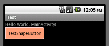
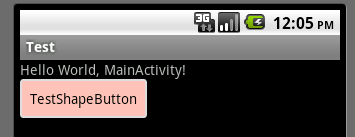
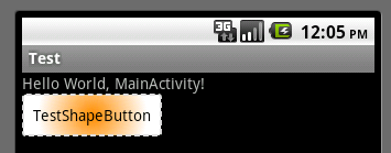
运行效果如下图:
一般状态:
获得焦点状态:
按下状态:
郑重声明:本站内容如果来自互联网及其他传播媒体,其版权均属原媒体及文章作者所有。转载目的在于传递更多信息及用于网络分享,并不代表本站赞同其观点和对其真实性负责,也不构成任何其他建议。


