
一款仿ios7的switches开关按钮
浏览数:25 /
时间:2015年06月11日
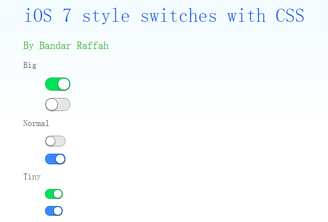
今天给大家介绍一款仿ios7的switches开关按钮。这款按钮也是纯css实现的。无需引js代码。在实现中给出了两种颜色,三种不同大小的demo。一起看下效果图:
实现的代码。
html代码:
   <div class="wrap" style="width: 600px; margin: auto;">
        <h1>
            iOS 7 style switches with CSS</h1>
        <h2>
            By Bandar Raffah</h2>
        <label>
            Big<input type="checkbox" class="ios-switch green  bigswitch" checked /><div>
                <div>
                </div>
            </div>
        </label>
        <label>
            <input type="checkbox" class="ios-switch bigswitch" checked /><div>
                <div>
                </div>
            </div>
        </label>
        <label>
            Normal<input type="checkbox" class="ios-switch green" /><div>
                <div>
                </div>
            </div>
        </label>
        <label>
            <input type="checkbox" class="ios-switch" /><div>
                <div>
                </div>
            </div>
        </label>
        <label>
            Tiny<input type="checkbox" class="ios-switch green tinyswitch" checked /><div>
                <div>
                </div>
            </div>
        </label>
        <label>
            <input type="checkbox" class="ios-switch tinyswitch" checked /><div>
                <div>
                </div>
            </div>
        </label>
  </div>
css代码:
  input[type="checkbox"]
        {
            position: absolute;
            opacity: 0;
        }

        /* Normal Track */
        input[type="checkbox"].ios-switch + div
        {
            vertical-align: middle;
            width: 40px;
            height: 20px;
            border: 1px solid rgba(0,0,0,.4);
            border-radius: 999px;
            background-color: rgba(0, 0, 0, 0.1);
            -webkit-transition-duration: .4s;
            -webkit-transition-property: background-color, box-shadow;
            box-shadow: inset 0 0 0 0px rgba(0,0,0,0.4);
            margin: 15px 1.2em 15px 2.5em;
        }

        /* Checked Track (Blue) */
        input[type="checkbox"].ios-switch:checked + div
        {
            width: 40px;
            background-position: 0 0;
            background-color: #3b89ec;
            border: 1px solid #0e62cd;
            box-shadow: inset 0 0 0 10px rgba(59,137,259,1);
        }

        /* Tiny Track */
        input[type="checkbox"].tinyswitch.ios-switch + div
        {
            width: 34px;
            height: 18px;
        }

        /* Big Track */
        input[type="checkbox"].bigswitch.ios-switch + div
        {
            width: 50px;
            height: 25px;
        }

        /* Green Track */
        input[type="checkbox"].green.ios-switch:checked + div
        {
            background-color: #00e359;
            border: 1px solid rgba(0, 162, 63,1);
            box-shadow: inset 0 0 0 10px rgba(0,227,89,1);
        }

        /* Normal Knob */
        input[type="checkbox"].ios-switch + div > div
        {
            float: left;
            width: 18px;
            height: 18px;
            border-radius: inherit;
            background: #ffffff;
            -webkit-transition-timing-function: cubic-bezier(.54,1.85,.5,1);
            -webkit-transition-duration: 0.4s;
            -webkit-transition-property: transform, background-color, box-shadow;
            -moz-transition-timing-function: cubic-bezier(.54,1.85,.5,1);
            -moz-transition-duration: 0.4s;
            -moz-transition-property: transform, background-color;
            box-shadow: 0px 2px 5px rgba(0, 0, 0, 0.3), 0px 0px 0 1px rgba(0, 0, 0, 0.4);
            pointer-events: none;
            margin-top: 1px;
            margin-left: 1px;
        }

        /* Checked Knob (Blue Style) */
        input[type="checkbox"].ios-switch:checked + div > div
        {
            -webkit-transform: translate3d(20px, 0, 0);
            -moz-transform: translate3d(20px, 0, 0);
            background-color: #ffffff;
            box-shadow: 0px 2px 5px rgba(0, 0, 0, 0.3), 0px 0px 0 1px rgba(8, 80, 172,1);
        }

        /* Tiny Knob */
        input[type="checkbox"].tinyswitch.ios-switch + div > div
        {
            width: 16px;
            height: 16px;
            margin-top: 1px;
        }

        /* Checked Tiny Knob (Blue Style) */
        input[type="checkbox"].tinyswitch.ios-switch:checked + div > div
        {
            -webkit-transform: translate3d(16px, 0, 0);
            -moz-transform: translate3d(16px, 0, 0);
            box-shadow: 0px 2px 5px rgba(0, 0, 0, 0.3), 0px 0px 0 1px rgba(8, 80, 172,1);
        }

        /* Big Knob */
        input[type="checkbox"].bigswitch.ios-switch + div > div
        {
            width: 23px;
            height: 23px;
            margin-top: 1px;
        }

        /* Checked Big Knob (Blue Style) */
        input[type="checkbox"].bigswitch.ios-switch:checked + div > div
        {
            -webkit-transform: translate3d(25px, 0, 0);
            -moz-transform: translate3d(16px, 0, 0);
            box-shadow: 0px 4px 8px rgba(0, 0, 0, 0.3), 0px 0px 0 1px rgba(8, 80, 172,1);
        }

        /* Green Knob */
        input[type="checkbox"].green.ios-switch:checked + div > div
        {
            box-shadow: 0px 2px 5px rgba(0, 0, 0, 0.3), 0 0 0 1px rgba(0, 162, 63,1);
        }

        /* Needless Page Decoration */
        body
        {
            -webkit-user-select: none;
            cursor: default;
            font: 18px "Helvetica Neue";
            color: rgba(0, 0, 0, 0.77);
            font-weight: 200;
            padding-left: 30px;
            padding-top: 0px;
            background: -webkit-linear-gradient(top, #f2fbff 0%, #ffffff 64%) no-repeat;
            background: -moz-linear-gradient(top, #f2fbff 0%, #ffffff 64%) no-repeat;
            background: -ms-linear-gradient(top, #f2fbff 0%, #ffffff 64%) no-repeat;
            background: linear-gradient(to bottom, #f2fbff 0%, #ffffff 64%) no-repeat;
        }
        h1
        {
            font-weight: 100;
            font-size: 40px;
            color: #135ae4;
        }
        h2
        {
            font-weight: 200;
            font-size: 22px;
            color: #03b000;
        }
        h3
        {
            font-weight: 200;
            font-size: 18px;
            color: rgba(0, 0, 0, 0.77);
            margin-top: 50px;
        }
        a:link
        {
            text-decoration: none;
            color: #f06;
        }
        a:visited
        {
            text-decoration: none;
            color: #f06;
        }
        a:hover
        {
            text-decoration: underline;
        }
        a:active
        {
            text-decoration: underline;
        }
注:本文爱编程原创文章,转载请注明原文地址:http://www.w2bc.com/Article/8897
郑重声明:本站内容如果来自互联网及其他传播媒体,其版权均属原媒体及文章作者所有。转载目的在于传递更多信息及用于网络分享,并不代表本站赞同其观点和对其真实性负责,也不构成任何其他建议。


