
CSS3 绘制360安仔小精灵
Css3图形通常由矩形,圆形,椭圆,三角形,梯形等组合而成。
矩形,为display:block的块级元素设定宽高,便能实现, 圆角矩形,椭圆,圆形,则通过border-radius 属性来得到。
圆角矩形,几种写法:
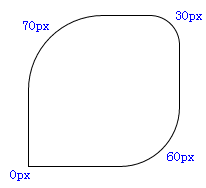
1, border-radius: 70px 30px 60px 0px;
按顺时针方向, 上左,上右,下右,下左, 分别定义了矩形4个角的弧度。
如图:
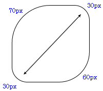
2、border-radius: 70px 30px 60px ;
不写第4个(下左角)的值,那么值默认与它的对角(上右角)相等,等同于 border-radius: 75px 30px 60px 30px;
如图:
3、border-radius: 70px 30px;
是border-radius: 70px 30px 70px 30px; 的缩写形式,对角的弧度相同。
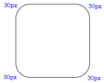
4. border-radius:30px
是border-radius: 30px 30px 30px 30px; 的缩写形式。
如图:
椭圆
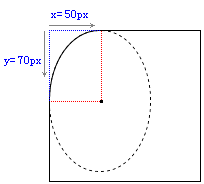
border-xxx-xxx-radius:x y; x, y两个值分别代表着椭圆长轴和短轴长度的一半,第1个值x,是以某角为原点,在横轴方向上取值,第2个值y,是以某角为原点,在竖轴方向上取值,例如: border-top-left-radius:50px 70px;
此时,原点为上左角,在横轴方向取值50px,竖轴方向取值70px,两点间画一条弧线,弧线为所在椭圆的1/4边。
如图:
同样, border-bottom-right-radius:50px 70px;
此时,原点则为下右角,在横轴方向取值50px,竖轴方向取值70px,两点间画一条弧线。
而要想让当前矩形变成椭圆,则要让xxx两个值,分别等于矩形长宽的一半,用百分比就是50%。
border-top-left-radius: 50% 50%;
border-top-right-radius: 50% 50%;
border-bottom-left-radius: 50% 50%;
border-bottom-right-radius: 50% 50%;
代码缩写为 border-radius: 50% ; 即可,得到的椭圆圆点正好是矩形的中心。
如果矩形长宽相等,则画出来的就是圆了。
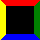
三角形的绘制,需要border属性来实现。
border: 20px solid;
border-top-color:red;
border-right-color:green;
border-bottom-color:blue;
border-left-color:yellow;
width:100px;
height: 100px;
background: black; // 背景色为黑。
如图:
为了更清楚的看清border所形成的三角形状, 我们将width 和 height的值均设置为0;
一目了然,产生4个不同颜色的三角形。
要形成三角,需要两个相邻边border的配合,只一个边是无法实现的。
如果只定义了红色的上边框,如下代码
border-top: 20px solid red;
width:100px;
height: 100px;
background: black;
那么看图,三角无法形成。

接下来,假如我们想得到红色三角形,就要让左右边框透明,下边框去掉(或根本不去定义下边框)。
border-top: 20px solid red;
border-left: 20px solid transparent;
border-right: 20px solid transparent;
width:0px;
height: 0px;
如图:
当然,你可以试着将左边框或右边框去掉 border-left:none,或(border-right:none) 看看会得到什么三角效果,
通过调整border的宽度,可以将这两个直角三角形拼接成任意形状的三角形。
  border-top: 40px solid red;
  border-left: 10px solid transparent;
  border-right: 30px solid transparent;
  width: 0px;
  height: 0px;
如图:

a 是 border-left:10px;
b 是 border-right:30px;
c 是 border-top:40px;
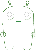
根据以上技术点的介绍,我们开始绘制安仔, O(∩_∩)O
基本框架的绘制,选择使用绝对位置position:absolute;来布局各个元素,它们需要有一个相同的父级元素position: relative; 来作为参照。
如图:
眼框
画边框弧线。
border-radius: 35px;
背景色径向渐变,从圆形的左上角开始。
background: -webkit-radial-gradient(left top, #fffffa, #d5d8df);
包括眼睛里的亮光,也是通过背景渐变的方式,这里采用的是线性渐变。
background: -webkit-gradient(linear, left top, 43% 70%, from(#fff), to(#000));
linear 线性
左上角开始(left,top),横向43%,纵向70%处截止渐变。
触角
Transform该属性允许我们对元素进行旋转、缩放、移动或倾斜,
transform-origin属性,设定中心点,整个图形绕着这个点进行角度变化, 例如:transform-origin:bottom left, 使用左下角作为原点。
rotate(angle) 定义 2D 旋转,规定角度。
-webkit-transform-origin: bottom left;
-webkit-transform: rotate(-13deg);
对基本线条着色的过程可以帮助我们调整z-index,也就是各个元素的重叠层次,多余的线条和边角要遮掉。
利用overflow:hidden的属性来截取所要的部分,绘制复杂图形的时候常用的方法就是切割和拼接,将图形切割成一个个简单的小块,通过层叠和旋转变化进行组合。
安仔的身体和双腿,就是拼接而成, 身体部分的弧线,通过border-top-left-radius 等属性来进行微调实现。
最终的结果:

demo源代码:


<!DOCTYPE html>
<html xmlns="http://www.w3.org/1999/xhtml">
  <head>
    <meta http-equiv="Content-Type" content="text/html; charset=gb2312" />
    <title>demo</title>
    <style type="text/css">
        .wapper {
            position: relative;
            width: 260px;
            height: 373px;
            left: 100px;
            margin-top: 100px;
        }
        .bodyMain {
            width: 260px;
            height: 373px;
            border: 3px solid #538a47;
            border-bottom: 3px solid  transparent;
            border-top-left-radius: 173% 70%;
            border-top-right-radius: 173% 70%;
            border-bottom-right-radius: 50% 290%;
            border-bottom-left-radius: 50% 290%;
            position: absolute;
            z-index: 5;
            background: -webkit-radial-gradient(bottom, rgba(194,220,131,1), #73c443);
        }
        .footer {
            width: 75px;
            height: 50px;
            border-top: 1px dotted #538a47;
            border-bottom: 3px solid #538a47;
            position: absolute;
            bottom: -9px;
            z-index: 7;
            background: -webkit-radial-gradient(bottom, rgba(194,220,131,1), #73c443);
        }
        .footerLeft {
            left: 16px;
            border-bottom-left-radius: 73% 151%;
            border-bottom-right-radius: 55% 119%;
            border-left: 2px solid #538a47;
        }
        .footerRight {
            right: 10px;
            border-bottom-right-radius: 73% 151%;
            border-bottom-left-radius: 55% 119%;
            border-right: 2px solid #538a47;
        }
        .chassis{
            border-top: 3px solid #538a47;
            position: absolute;
            bottom: 42px;
            width: 98px;
            left: 84px;
            z-index: 6;
            background-color: black;
        }
        .eyes{
            width: 70px;
            height: 70px;
            border-radius: 35px;
            position: absolute;
            z-index: 8;
            background: -webkit-radial-gradient(left top, #fffffa, #d5d8df);
            box-shadow: 1px 1px #4f893c;
        }
        .eyesLeft {
            left: 25px;
            top: 50px;
        }
        .eyesRight {
            right: 17px;
            top: 50px;
        }
        .pupil{
            position: absolute;
            top: 6px;
            left: 13px;
            width: 38px;
            height: 38px;
            border: 1px solid #aaa;
            border-radius: 50%;
            background-color: #000;
        }
        .pupil i {
            display:block;
            width: 25px;
            height: 25px;
            border-radius: 25px;
            background: -webkit-gradient(linear, left top, 43% 70%, from(#fff), to(#000));
            position: absolute;
            left: 5px;
            top: 3px;
            z-index: 10;
        }
        .pupil cite {
            display:block;
            width: 25px;
            height: 25px;
            border-radius: 25px;
            background: -webkit-gradient(linear, right bottom, 79% 61%, from(#fff), to(#000));
            position: absolute;
            left: 10px;
            top: 10px;
        }
        .mouth{
            position: absolute;
            left: 110px;
            top: 120px;
            border-bottom: 10px solid #358a46;
            width: 45px;
            height: 10px;
            border-bottom-right-radius: 50px 30px;
            border-bottom-left-radius: 50px 30px;
        }
        .arm {
            position: absolute;
            width: 40px;
            height: 40px;
            border: 3px solid #538a47;
            border-radius: 50%;
            top: 60%;
            background: -webkit-radial-gradient(bottom, rgba(194,220,131,1), #73c443);
            z-index: 4;
        }
        .arm_l {
            left: -20px;
        }
        .arm_r {
            right: -30px;
        }
        .arm i {
            position: absolute;
            display: block;
            width: 30px;
            height: 30px;
            border-radius: 30px;
        }
        .arm_r i {
            background: -webkit-gradient(linear, right top, 59% 53%, from(#fff), to(rgba(147,205,92,0.1)));
            left: 7px;
            top: 1px;
        }
        i.armLeft{
            left: -10px;
            border-top-left-radius: 14px 80px;
            position: absolute;
            top: 143px;
            display: block;
            width: 10px;
            height: 80px;
            border: 3px solid #538a47;
            background: -webkit-linear-gradient(bottom, rgba(194,220,131,1), #73c443);
        }
        i.armRight{
            position: absolute;
            top: 143px;
            display: block;
            width: 10px;
            height: 80px;
            border: 3px solid #538a47;
            background: -webkit-linear-gradient(bottom, rgba(194,220,131,1), #73c443);
            left: 259px;
            border-top-right-radius: 14px 80px;
        }
        .corner {
            width: 25px;
            height: 25px;
            border: 3px solid #538a47;
            position: absolute;
            height: 25px;
            width: 5px;
            top: -19px;
            z-index: 4;
            background: -webkit-linear-gradient(bottom, rgba(194,220,131,1), #73c443);
        }
        .cornerLeft {
            left: 63px;
            -webkit-transform-origin: bottom left;
            -webkit-transform: rotate(-13deg);
            -moz-transform-origin: bottom left;
            -moz-transform: rotate(-13deg);
            -o-transform-origin: bottom left;
            -o-transform: rotate(-13deg);
            transform-origin: bottom left;
            transform: rotate(-13deg);
        }
        .cornerRight{
            left: 199px;
            -webkit-transform-origin: bottom left;
            -webkit-transform: rotate(13deg);
            -moz-transform-origin: bottom left;
            -moz-transform: rotate(13deg);
            -o-transform-origin: bottom left;
            -o-transform: rotate(13deg);
            transform-origin: bottom left;
            transform: rotate(13deg);
        }
        .corner i {
            width: 20px;
            height: 20px;
            border: 3px solid #538a47;
            display: block;
            border-radius: 20px;
            position: absolute;
            top: -26px;
            left: -10px;
            background: -webkit-radial-gradient(bottom, rgba(194,220,131,1), #73c443);
            z-index: 5;
        }
        .corner cite{
            display:block;
            width: 17px;
            height: 17px;
            border-radius: 17px;
            background: -webkit-gradient(linear, left top, 46% 95%, from(#fff), to(rgba(147,205,92,0.2)));
            position: absolute;
            left: -6px;
            top: -22px;
            z-index: 7;
        }
        .footerShadow {
            background-color: #949599;
            width: 240px;
            height: 30px;
            position: absolute;
            bottom: -10px;
            left: 10px;
            border-radius: 50%;
            z-index: 0;
        }
        .white {
            height: 50px;
            width: 100px;
            position: absolute;
            bottom: -5px;
            width: 265px;
            background-color: #fff;
        }
    </style>
  </head>
<body>
<div style="width:0px;height:0px;overflow:hidden;" id="aaaa">
    <img src=" http://p0.qhimg.com/d/inn/4e1ae987/icon/apple-touch-icon-120x120.png" alt="" />
</div>
    <!-- <img src="log.jpg"> -->
    <div class="wapper">
        <div class="corner cornerLeft">
            <i></i>
            <cite></cite>
        </div>
        <div class="corner cornerRight">
            <i></i>
            <cite></cite>
        </div>
        <div class="arm arm_l"></div>
        <i class="armLeft"></i>
        <div class="arm arm_r"><i></i></div>
        <i class="armRight"></i>
        <div class="bodyMain">
            <div class="mouth"></div>
            <div class="white"></div>
        </div>
        <div class="eyes eyesLeft"><div class="pupil"><i></i><cite></cite></div></div>
        <div class="eyes eyesRight"><div class="pupil"><i></i><cite></cite></div></div>
        <div class="footer footerLeft"></div>
        <div class="footer footerRight"></div>
        <div class="chassis"></div>
    </div>
</body>
</html>
郑重声明:本站内容如果来自互联网及其他传播媒体,其版权均属原媒体及文章作者所有。转载目的在于传递更多信息及用于网络分享,并不代表本站赞同其观点和对其真实性负责,也不构成任何其他建议。


